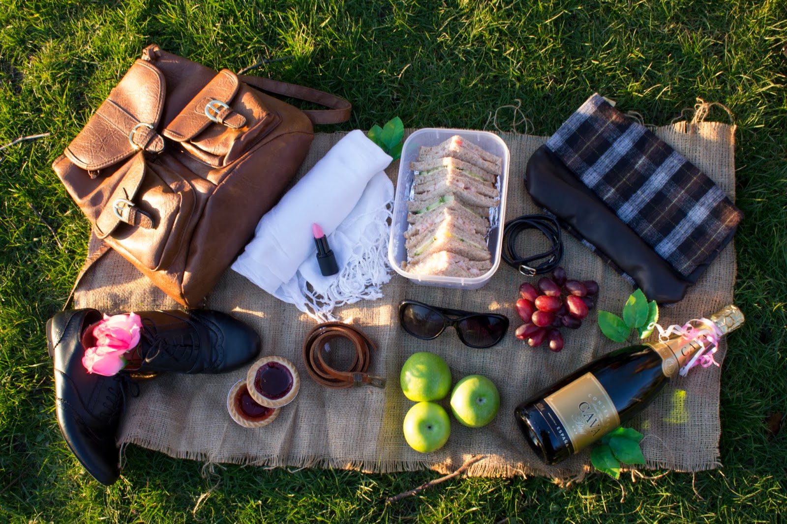
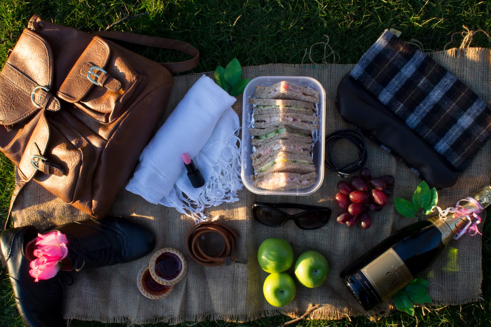
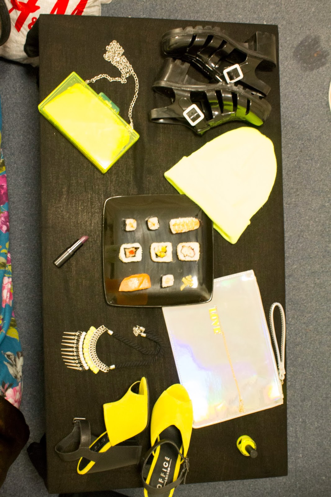
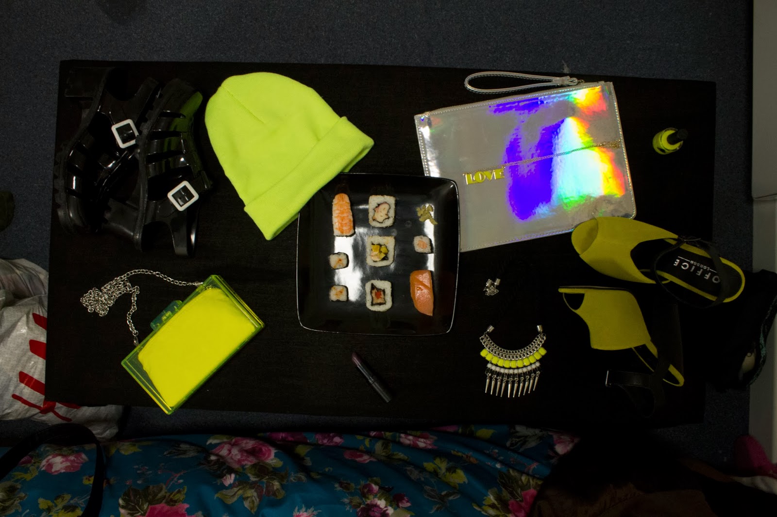
My trend boards for Spring/Summer 2014
A dominating trend I found within the accessories for spring/summer was exotic skins, found in all colours shades and patterns, the amphibious skin was out in full force.
Another trend I found was rose gold, beautiful glamorous and feminine, a twist on timeless gold.
An expected trend and one which does tend to crop up around spring/summer time was pastel shades. there is nothing better than showing off a tan or getting in the mood for great weather by wearing beautiful pastel shades.
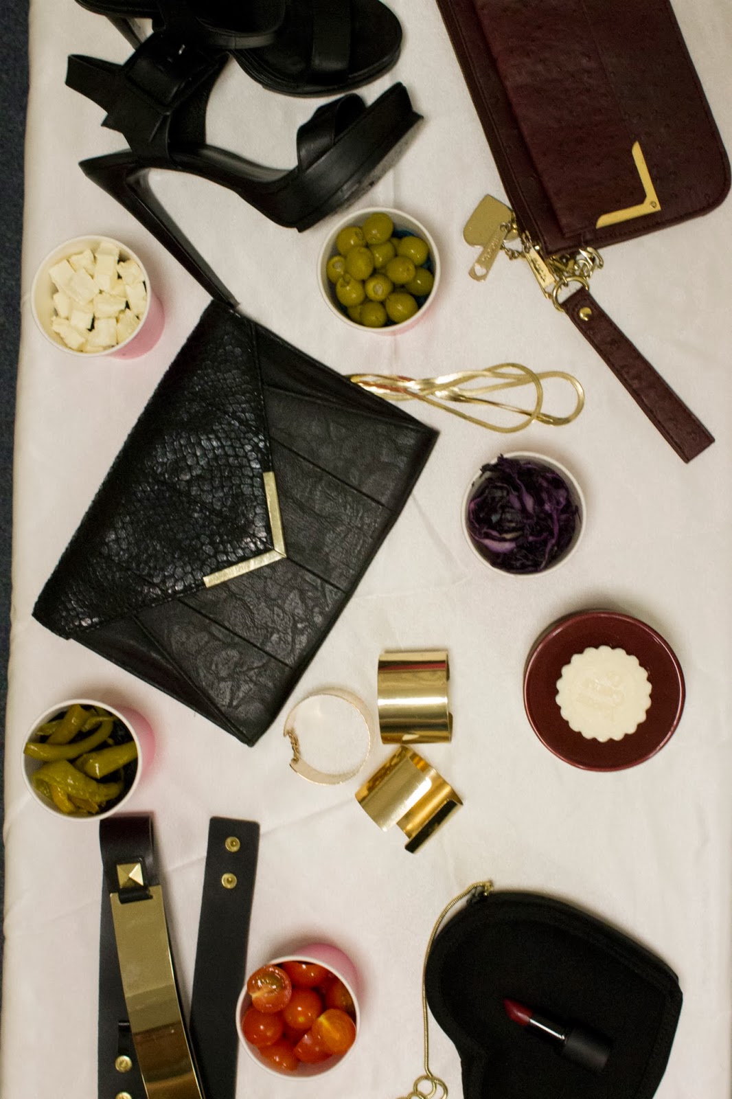
I personally loved the metal trend I found throughout the collections, it has a very modern and quirky feel. I think the pieces would be very statement and really make an outfit stand out.
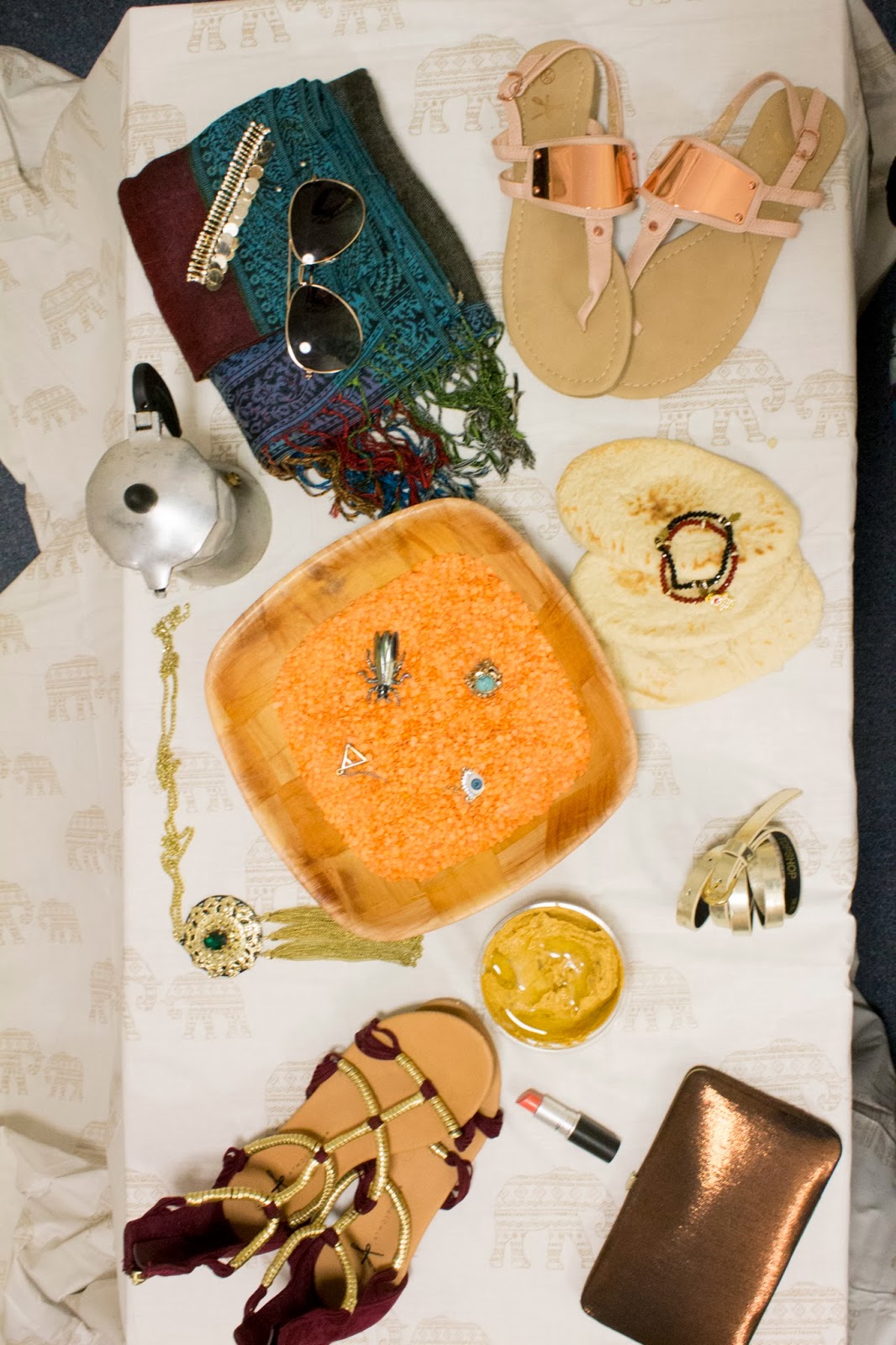
The trend of camel tones really caught my eye, the pieces would be versatile and bring a slight twist on the nudes which are always popular around summer/spring time as they would go with a variety of outfits and looks.